Hi Experts,
Couple of weeks, I've started working in OracleApex and most of the things looks like fun to work with and I'm currently working with 20.1.0.00.13.
My requirement is to merge these two charts and display a two level chart.
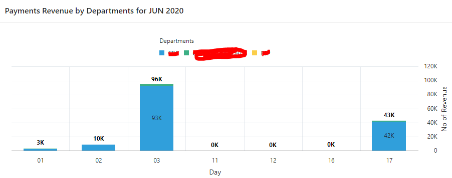
First Chart is used to display number of online transactions done by user for different departments for all days for current month and year

Revenue generated by each department against above transactions for all days for current month and year
I've been able to merge them into one but the problem I'm facing is that it doesn't look clean and I would like to add few more labels if possible.
Current Output
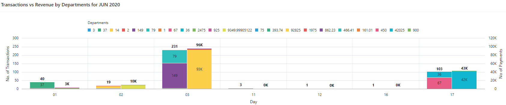
What I did was to use to series one for transactions and another for revenue and in both series name attribute points to value which made the values stacked made for every department.
Expected Output I would like to show series name with departments and not with all the series value(s) and add a transaction revenue label under every day so that comparison for the end user pretty evident

Can this be achieved or what is your recommendation to represent such statistical information in Oracle Apex
Appreciate any help/guidance.
PS: This is my first post on Apex so if I've missed to provide any information then please let me know.
Cheers, AJax