When developing my own application, I was bothered by the fact that the size of the button for displaying and hiding the application menu was way too small on my cell phone.
That's why I developed my own CSS that makes the size of this button customizable.
The desired size is defined via a variable (--nav-button-size) and the content of the button is dynamically adjusted.
In the CSS of the Universal Theme there is a variable for the size (--a-button-icon-size) but it is used for all buttons in the navigation bar and is not used for the calculation of the thickness and position of the lines within the menu button.
Here is the code that you can copy into the user-defined CSS of the theme roller. The --nav-button-size should be adjusted according to your wishes. I did not use media-queries, so the size stays the same on all devices. This works for me.
I developed this for Universal Theme Version 24.1.
:root{

/*Size of the navgation button*/
--nav-button-size : 3.2rem;

/*Adjust speed of menu-transitions*/
--ut-layout-transition: 0.6s;

/*Sizes of the lines shown in the navigation button:*/
--ut-header-controls-icon-height: calc(var(--nav-button-size ) * 0.1);
--ut-header-controls-icon-short-line: calc(var(--nav-button-size ) * 0.6);
--ut-header-controls-icon-long-line: calc(var(--nav-button-size ) * 0.9);

}

/*Adjust size of button:*/
#t_Button_navControl{
  width: var(--nav-button-size) ;
  height: var(--nav-button-size) ;
}

/*Adjust sizes of middle, upper and lower line:*/
.t-Header-controlsIcon{
  left: calc((var(--nav-button-size) - var(--ut-header-controls-icon-long-line)) / 2);
  width: var(--ut-header-controls-icon-long-line);
}

.t-Header-controlsIcon:before {
  top: calc(var(--ut-header-controls-icon-height)* -2);
  width: var(--ut-header-controls-icon-short-line);
}

.t-Header-controlsIcon:after {
  top: calc(var(--ut-header-controls-icon-height)* 2);
  width: var(--ut-header-controls-icon-short-line);
}

/*On Hover all the lines get the same size:*/
.t-Button--headerTree:hover .t-Header-controlsIcon,
.t-Button--headerTree:hover .t-Header-controlsIcon:before,
.t-Button--headerTree:hover .t-Header-controlsIcon:after
{
  width: var(--ut-header-controls-icon-long-line);
}

/*Overwrite some states that originally use the variable --a-button-icon-size: */
.t-Button--headerTree.is-active:focus .t-Header-controlsIcon:before,.t-Button--headerTree.is-active:hover .t-Header-controlsIcon:before {
  opacity: 0;
  top: 0;
  width: var(--ut-header-controls-icon-long-line);
}

.t-Button--headerTree.is-active:focus .t-Header-controlsIcon:after,
.t-Button--headerTree.is-active:hover .t-Header-controlsIcon:after {
  top: 0;
  transform: rotate(-90deg);
  width: var(--ut-header-controls-icon-long-line)
}

/*Remove outline from navigation button:*/
#t_Button_navControl:focus {
    outline: none;
}
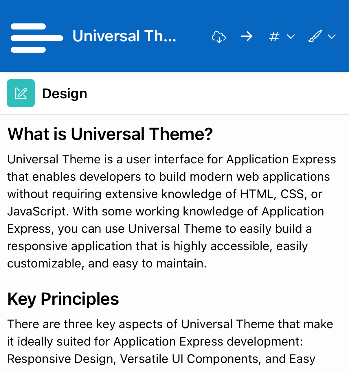
Here are two sreenshots of the Universal Theme App taken from my iPhone:
Normal UT - Button :
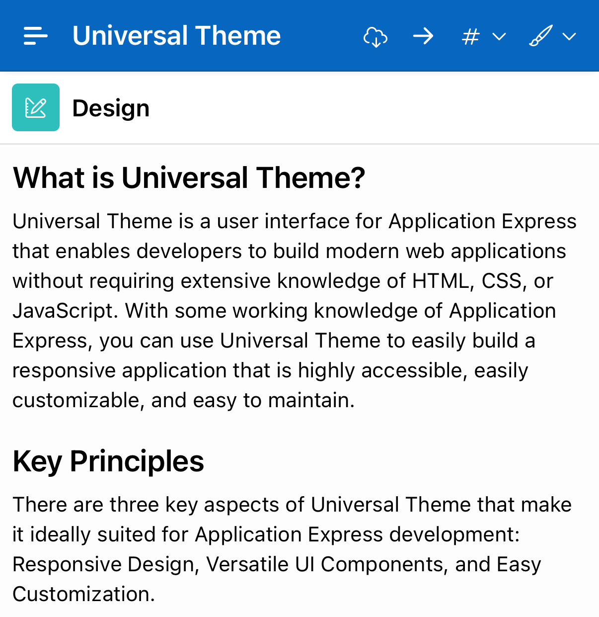
Enhanced (bigger) button: