Hi, so I'm implementing a simple bubble chart but there are some styling issues that I want to fix. They seem simple enough, , but I'm unable to find a way to do it.
there are two specific problems:
By the way, I'm using apex oracle 20.1 (Product Build 20.1.0.00.13)
1.- Data point label:
for the data point label, the one shown in each bubble, i need to separate the label that I create with a skip line, line break, or newline so that the value is shown in two lines. In the query, I create the label, as a concatenation of the category I want to show and a number of documents that type have done ( in my specific case, I have a set of KPIs and the number of instrument or analysis that the client has done to try to improve it ).
So the text is just select …. KPI||' Equipos:'||number_instrument Category_label, … from dual
I thought that maybe just trying to add <br>, or \n to the query directly would do the job but doesn't work: it just shows as text or is escaped, and doesn't do anything.
maybe there is an option of wrapping the text, that I could include in the initialization part of the chart, or somehow force the text to separate in a specific part, but I'm not able to find it (I'm not that good at javascript. I tried to concatenate the skip line in the initialization code, but the same happen).
so any help is appreciated.
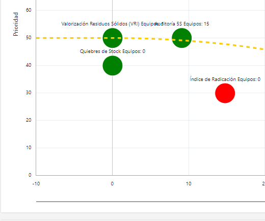
2. chart axis edges or hiding min and max value
ok, so I know that in the X and Y axis, you can define a minimum and maximum value, in this case, 0 and 100 for each axis, and it works great. the problem is the edge cases or better said, the data point on which X is 0 or 100 and/or Y is 0 or 100 because the bubble is cut by half.
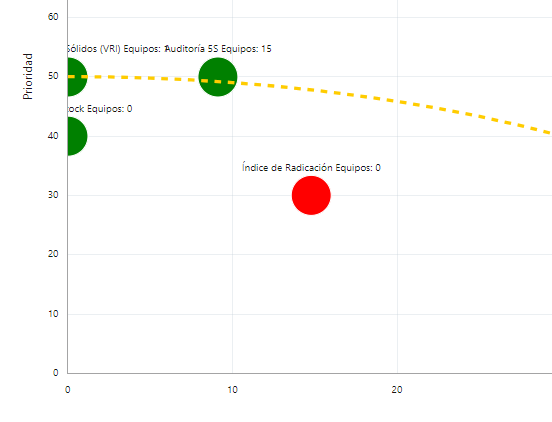
a simple solution was to just extend the minimum value and maximum value a little to each direction, so the bubble appears complete, like the first image, but the problem is that the negative values or values that go higher than 100 on the axis, doesn't make sense to the end user, and causes confusion.
So, is there a way to hide some of the values on the axis via javascript that I can include in the initialization code section, by some condition, like, if axisXlabel is in ('-10','110') then axisXlabel = ‘ ’, so that the value doesn't appear (same to axis y), but the chart structure is maintained, so that the bubbles stay complete, or is there any other way to fix this? like I said, I do not know enough of javascript or the jet options, so I'm having trouble to find a way.
I did search in different forums for some kind of solution and tried what I find, but no luck. that said, I could have missed some solutions, maybe I didn't search the right word for them, so just a link to them, it would be enough help, and it is also appreciated.
regards.