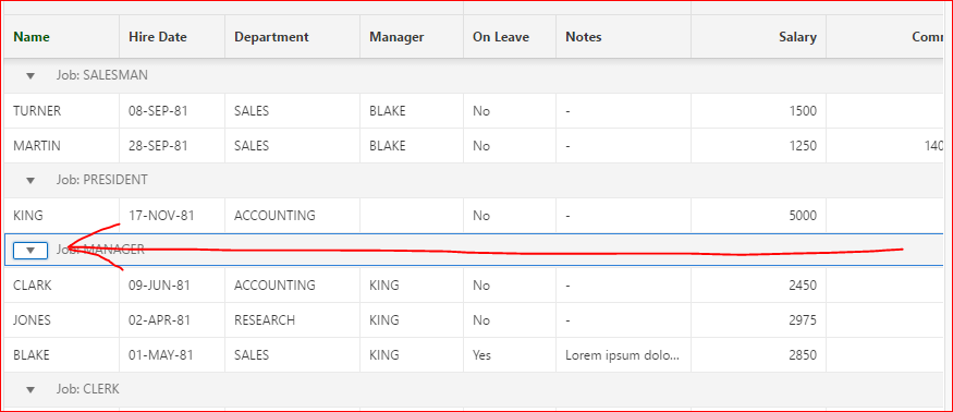
It is not intuitive to end-users that they have to click on the arrow icon to expand / collapse the region.
I have seen many users trying to click on the header to collapse / expand the region.
Also, If the mouse pointer is on the right side of the screen / window, then no need to force the user to move to the left-side to click on the arrow icon.
If you wish, create a demo and submitted to Get a peek into the mind of your users. | Peek by UserTesting
The same applies to Control Break in IG,