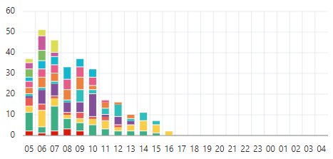
Just one question regarding chart regions.
When I create a vertical bar chart, I always notice a huge difference whenever I select "Fill Gaps in Chart Data" as its property - when selected, data is more accurately related when compared to SELECT instruction results, however I cannot sort them as I need to. Could someone please tell me what does this property mean to charts, given that I have no apparent gaps in my data? Print screens comes below to illustrate it.
Chart is vertically stacked. If description and print screens aren't enough to make my question clear, I can upload it online.
Fill Gaps in Chart Data = Selected:
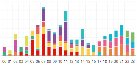
Fill Gaps in Chart Data = Unselected: