We have a histogram chart that looks like the following using our current charting framework, but would like to switch it to OJET:
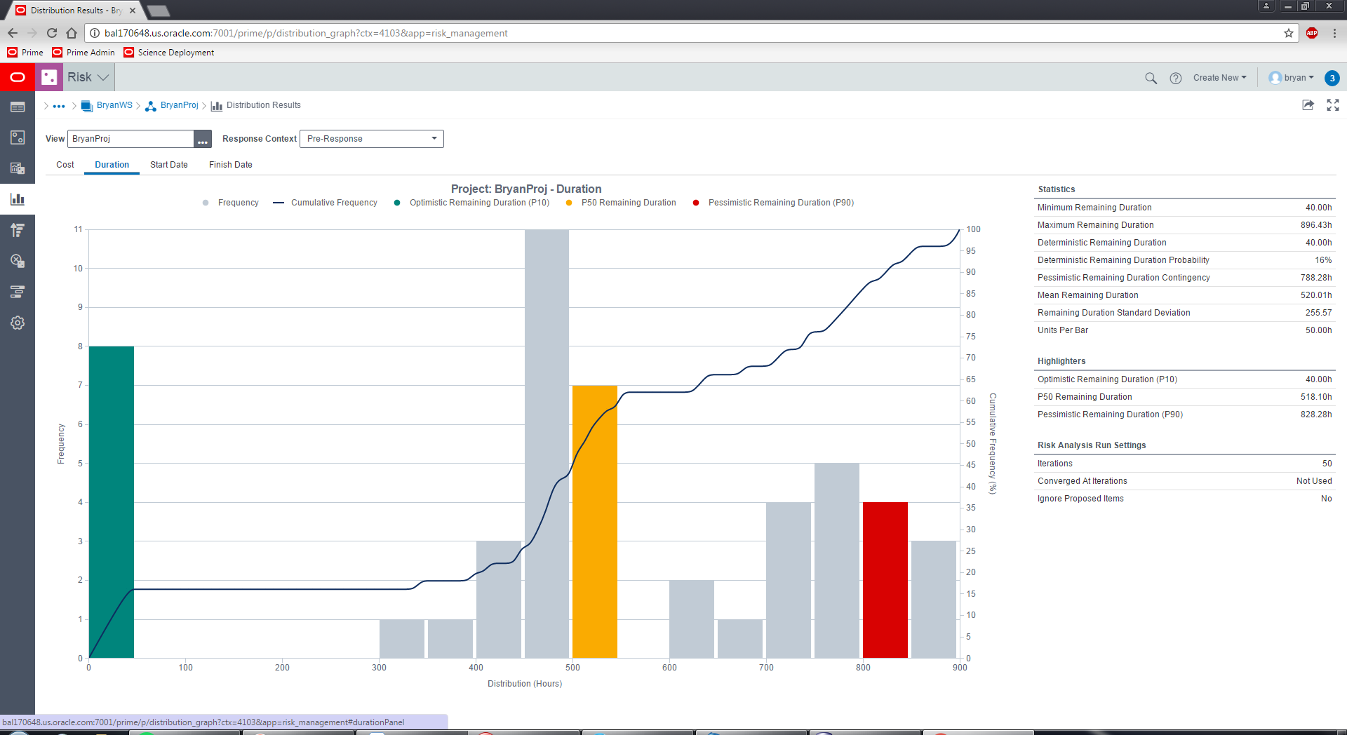
The way our current charting framework works is that on the X axis, I provide a type (which in this case is linear) and then a domain which is 0 to 900. Then for the bars, which are linked to the Y axis on the left, I simply provide X and Y coordinates (i.e: [0,8], [50,0], [100,0] ... [800,4], [850,3]) and it draws them (I also have tickAlign set to "right" so that the bar will be drawn to the right of the tick). The bars are colored using stacked bars since they are just highlighters for which bar contains the Optimistic/P50/Pessimistic iteration results. The line is then passed similar coordinates (but a lot more of them), where the Y coordinate is for the Y axis on the right, such that it lines up exactly with the bars as you can see on the initial bar where it goes straight from [0,0] to [50,16] since the first 8 iterations are 16% of the 50 iterations that were run, as represented by that first green bar.
Looking at the current bar/line charts in the cookbook, plus looking at the API documentation, this does not seem to be possible in OJET. The charts expect groups rather than X coordinates with no way to align the ticks. Also, at least in the cookbook example, the groups (i.e., X axis) are shared by both the line and the bars, when in the above example while they would share some of the X coordinates, the line would have many more X,Y pairs than the bars have, which would need to be spaced properly where it would fall on the X axis. Also on this page for the Start Date and Finish Date tabs, the X axis is actually time, but otherwise works the same way by providing an X coordinate which is a time and a Y coordinate for number of hits.
Am I correct that this chart cannot be built using OJET Charts?