Hello All,
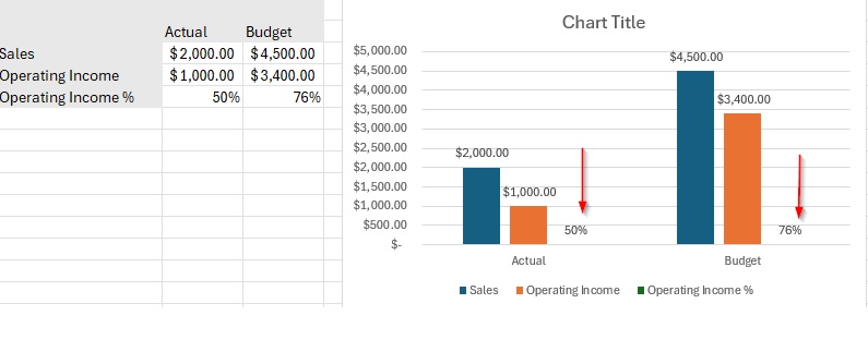
I’ve created a chart in Oracle Narrative Reporting that compares actual vs. budget data for Sales, Operating Income, and Operating Income %. The chart is set up similarly to what is shown in the example here.
However, I’ve noticed that for the Operating Income % account member, I am unable to view the depth (details) in the chart, unlike the other two account members (Sales and Operating Income). In my actual report, the Y-axis scale is set to millions.
Is there a way to adjust the settings or modify the Y-axis scale so that I can display the depth for Operating Income % the same way as the other accounts?
Thank you in advance for any guidance or suggestions!
Best regards,
Sabaritha