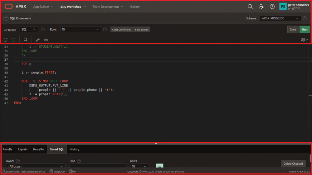
They take up a third of the screen on my 1000x800 pixel laptop. How anyone thought that this was passable UX is beyond me.
Give me some control to hide these menus as currently having < 15 lines of usable screen space is egregious.
When splitting I expect to see, if at all possible the entire area from the bottom of the browser to slightly under the address bar.
When not splitting I expect to see the same area but with a small amount larger of vertical space, maybe those poorly placed bars could go to the left or right sides.
See the areas highlight in red in the included screenshots.
Image of split screen:
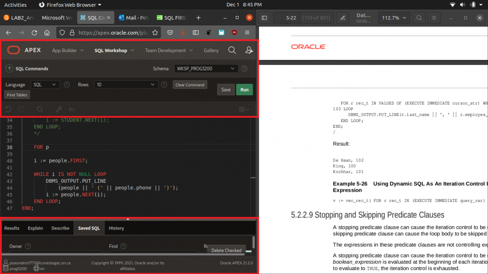 Image of full screen: