As part of this initial public release of Oracle JET, we're very excited to introduce our first set of data visualizations targeted for the JavaScript developer. For those of you that are familiar with ADF or MAF, you'll feel right at home with these new components, as they share a common underlying code base. Each of our visualizations is exposed as a jQueryUI widget and supports:
- Accessibility: Includes screen reader, keyboard, and high contrast support
- Animation: Initial display and data change animation, with a focus on helping the end user to better understand the underlying data.
- Interactivity: Consistent interaction experience with support for keyboard, mouse, and touch interactions.
- Internationalization: 28 languages, 160+ locales, and right-to-left reading direction.
- Performance: Optimized for large data sets and small multiples.
- Responsive Layout: Automatic resize support and layout optimizations for small form factors.
- Test Automation: APIs are provided to support recording and playback of events as well as verification of component state.
- Two-way Data Binding: Optional knockout binding to simplify synchronization of attribute values.
There's too much to cover in just one post, so I'm going to start by introducing our chart components. The charts provide dozens of different ways to visualize a data set, including:
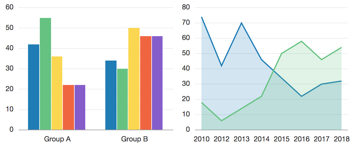
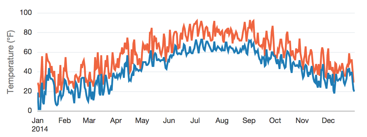
Bar, Line, Area, Range, and Combo Charts
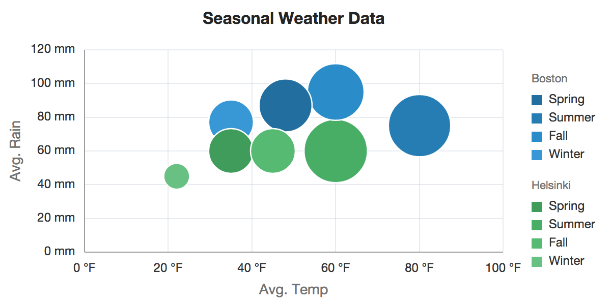
Scatter and Bubble Charts
**
**
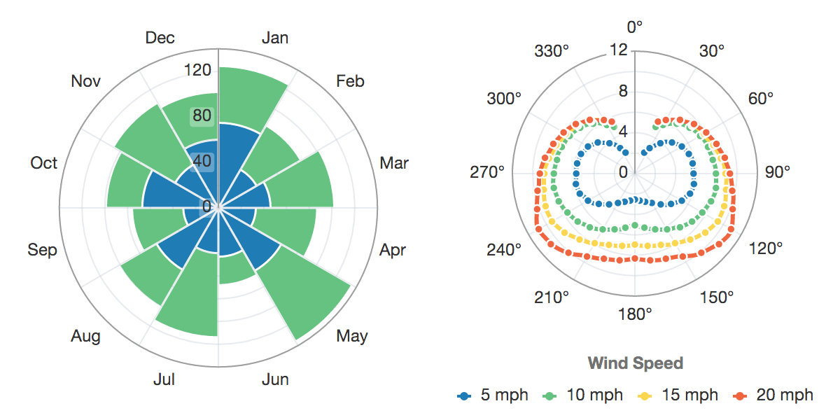
Polar Charts
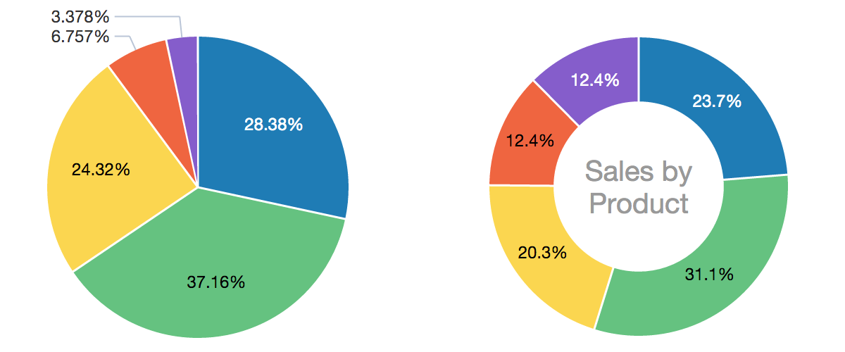
Pie and Donut Charts
**
**
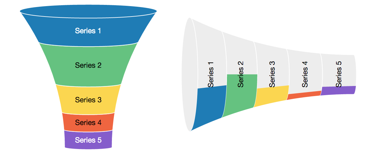
Funnel Charts
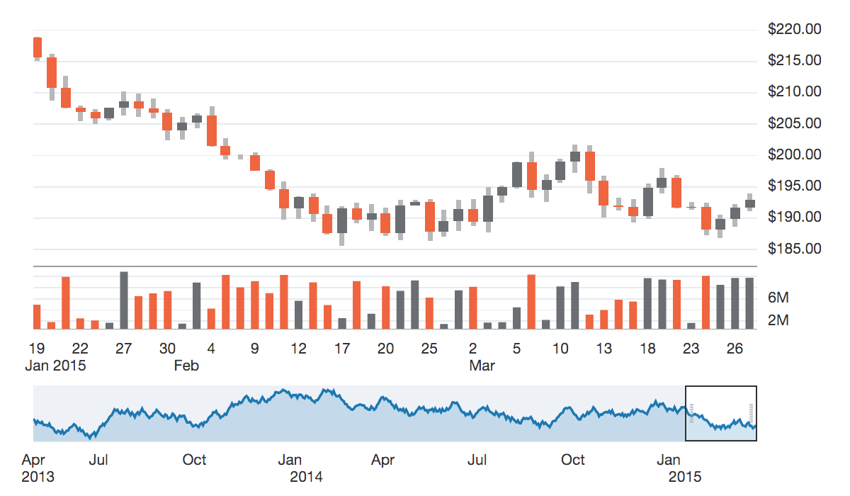
Stock Charts
**
**
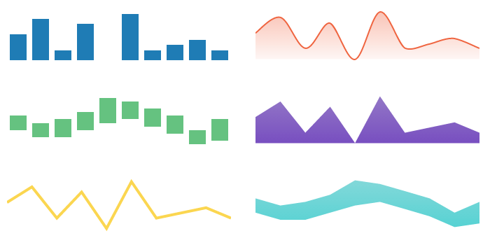
Spark Charts
**
**
To learn more, please see the chart demos in the Oracle JET Cookbook. Hidden away in the See Also section of the chart pages are a set of "Custom Chart" demos, which show some common and uncommon ways to configure the charts:
We'll be digging into specific features and providing tutorials in future posts. There are also many other data visualizations to explore, including the diagram, gauges, thematic map, treemap, and sunburst, and we'll be writing about those in more detail as well. We hope you enjoy using the charts and please let us know in the comments section if you have any feedback or questions.