Hi guys,
The user's requirement is something like below;
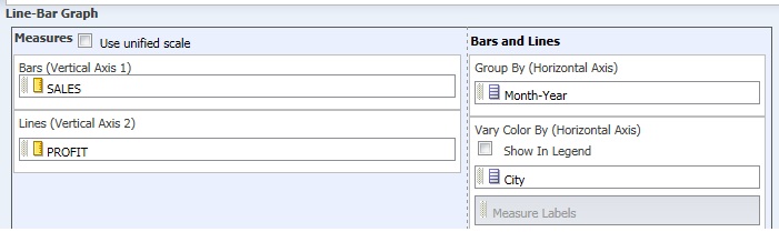
For Example, I have two Measure column SALES and PROFIT
And Also have two attribute column;Month-Year and City.
Year shall be on X-axis, The graph needs to show the city wise sales and profit for a particular Month-Year. While Implementing the same, the Line graph(Profit) is splitting to Number of Lines equals to city count. For example, If I have 4 cities, then instead of showing one line profit for the entire Month-Year range, its splitting to 4 different lines, which going against my requirement.
For more detail, pls find the image;
Anyone has done it..pls revert.
Thanks
Abinash