Thanks in advance for any help you can offer for this question. I have a chart that provides provides a tool tip when you hover over a bar. However, the labels are unclear, so I'd like to edit them.
I'd like to change the following...
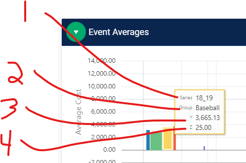
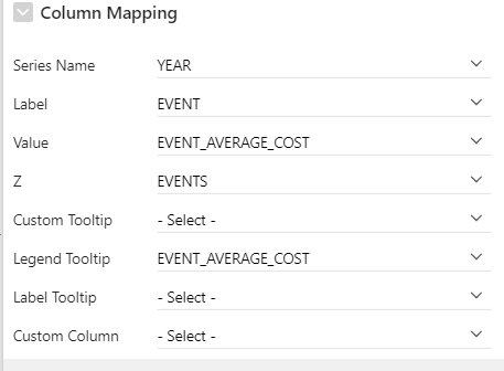
Column Mapping...
-
Series --> Year
-
Group --> Sport (Event)
-
Y --> Average Cost
-
Z --> Event Count (Events)
Thanks again,
josh