Skip to Main Content

APEX

Announcement

For appeals, questions and feedback about Oracle Forums, please email oracle-forums-moderators_us@oracle.com. Technical questions should be asked in the appropriate category. Thank you!

Interested in getting your voice heard by members of the Developer Marketing team at Oracle? Check out this post for AppDev or this post for AI focus group information.

How to change format of tooltip on line chart?

jmaagJan 22 2020 — edited Jan 23 2020

Hello,

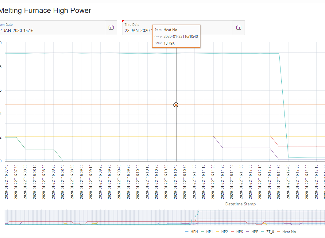
I have a need to format the tooltip on charts to show the exact data and not the rounded value. The value is being rounded to 18.79K the actual value is 18789. This is a heat number for us and is needed to identify with other values on the chart.

see the picture below. We have tried various formatting of x y y2 axis. If i need to add javascript or html to format it I don't know where to put it. I was hoping this was declarative like the axis values are to use a format and setting a pattern.

The heat no is using a y2 axis.

Thanks in advance for any help.

pastedImage_0.png

This post has been answered by Hilary Farrell-Oracle on Jan 23 2020
Jump to Answer
Comments
Post Details
Added on Jan 22 2020
3 comments
902 views