Hi. I am on APEX 22.2.4.
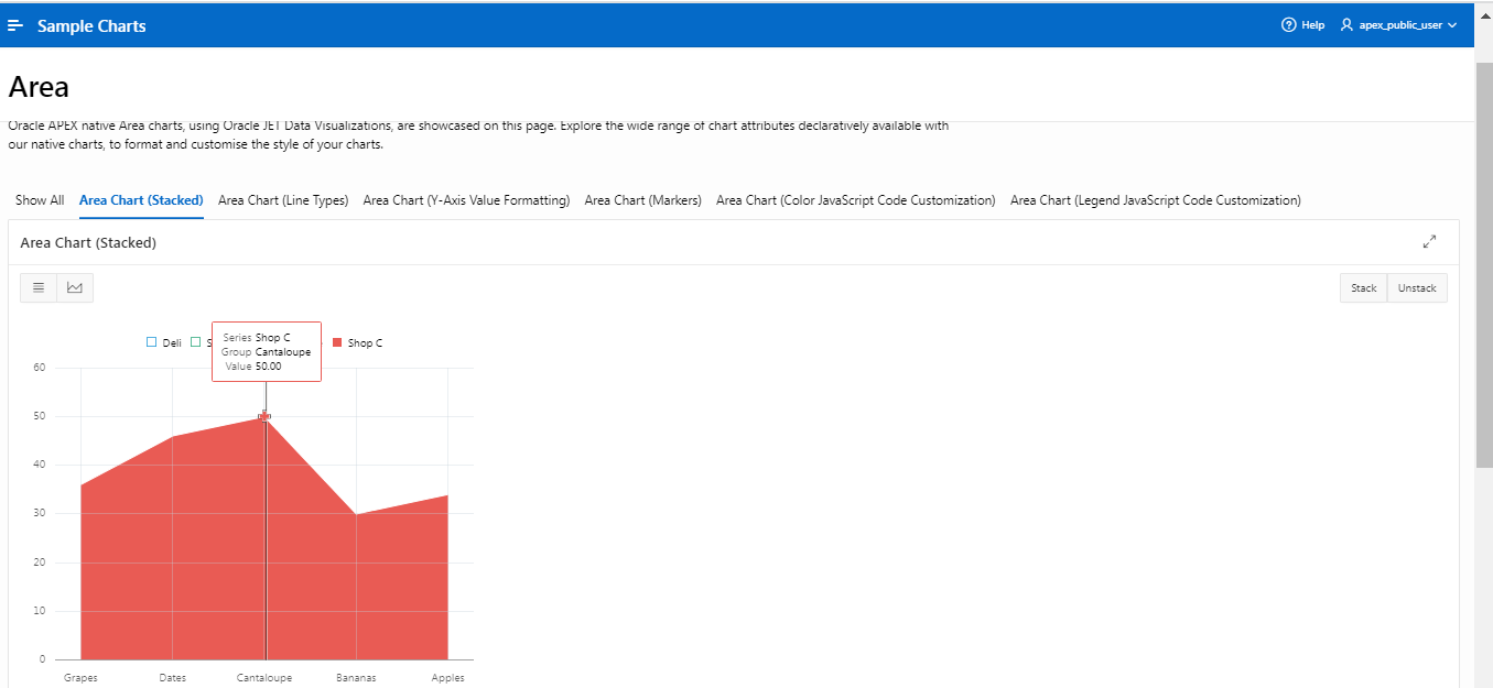
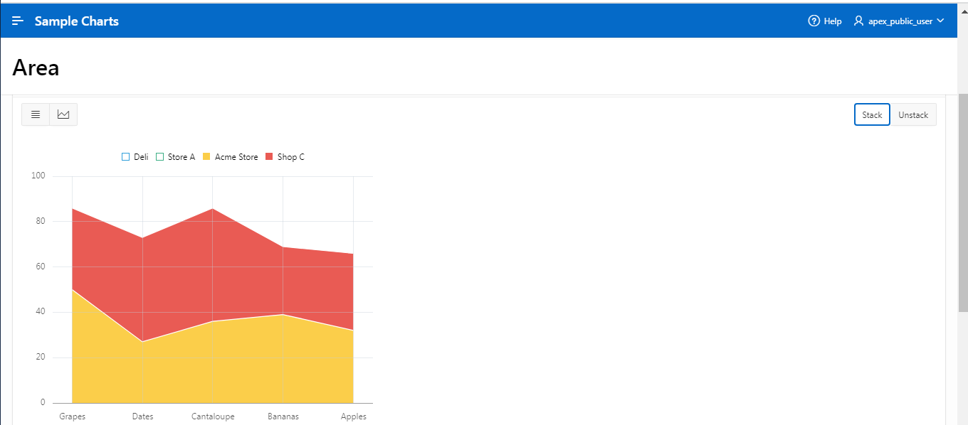
I am surfing the sample chart app> Area chart. The chart shows products and their quantities.
When displaying one series(Shop C - in red), it shows the a value of 50 for “Cantaloupe” in the tooltip(I think it's called the short description) and on the Y axis too. But when show another series i.e “Acme Store” - in yellow, the cantaloupe shows still shows value of 50 on the tooltip but points to 80 on the Y axis. How is that? How should user read it?
I can not figure out what the benefit of a stacked chart is? How should user make use of it?