Hi,
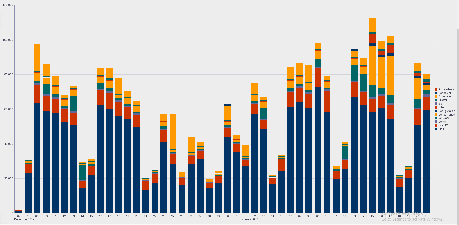
I have created a user defined report using the stacked graph. The graph is using only 5 colors.
Since there are more than 5 different WAIT_CLASS, the result is that different WAIT_CLASS are using the same color.
I wonder if there a way to:
1. Set the report to use more that 5 colors (some fixed larger number).
2. Make the tool itself automatically give different colors to different wait_class, as many as the query returns.
And this is the query behind the report -
select trunc(sample_time,:FORMAT),nvl(wait_class,'CPU'),count(*) cnt
from dba_hist_active_sess_history
where sample_time > sysdate-:num_days_ago
AND SESSION_TYPE='FOREGROUND'
and user_id in (76,77)
group by trunc(sample_time,:FORMAT),wait_class
order by 1, trunc(sample_time,:FORMAT),decode(wait_class,
null,1,

'User I/O',2,

'System I/O',3,

'Commit',4,

'Network',5,

'Concurrency',6,

'Application',7,

'Configuration',8,

'Administrative',9,

'Scheduler',10,

'Other',11,

'Idle',12,13)