I'm working with a bar chart in Oracle APEX that displays ACB Opening and Net Churn percentages. Currently, I've implemented a custom tooltip that shows these values when hovering over chart elements:
'ACB Opening : ' ||TO_CHAR(SUM(ACB_OPENING),'99,99,99,99,99,999') ||chr(10)||
'Net Churn % : ' || TO_CHAR(round(((((SUM(ACB_CLOSING)-(sum(NC_MTD)))- SUM(ACB_OPENING)) / SUM(ACB_OPENING))*100),2), '99999999900.99') || '%' as tooltip
Current Implementation:
- The tooltip successfully displays the values
- The formatting works as expected
- Values display in default color (black)
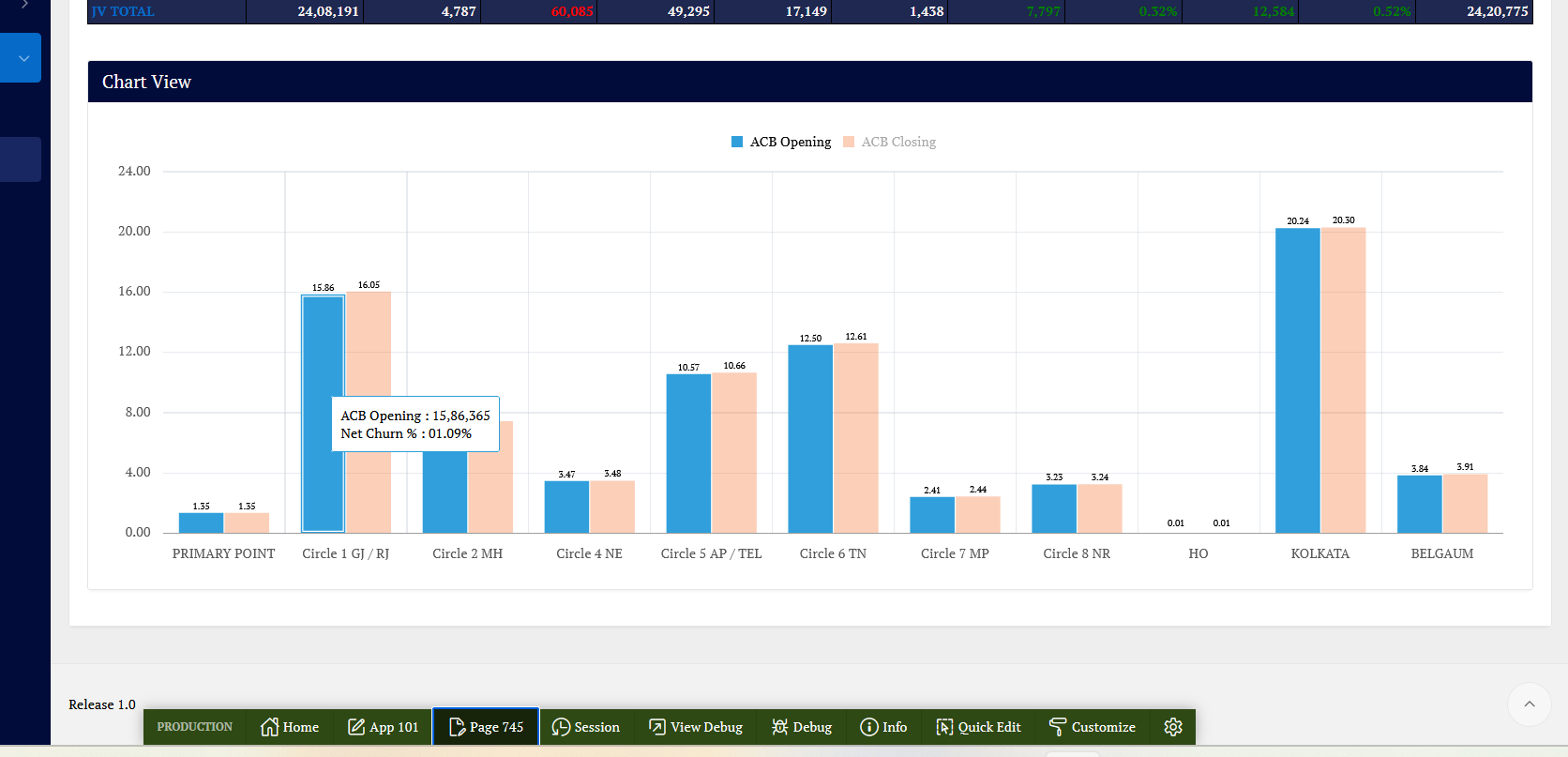
Desired Implementation:
- I want the ACB Opening and Net Churn values to display in:
-
Red color when negative
-
Green color when positive
Is it possible to apply conditional formatting to specific parts of a tooltip in Oracle APEX charts? If so, what's the recommended approach?