Hi, I am trying to create a chart for customer feedback table and every feedback has only one answer, either Excellent, Good, Average, Bad and Very Bad. Below is the layout;
| **ID
** | **Staff
** | **Excellent
** | **Good
** | **Average
** | **Bad
** | **Very Bad
** |
| 1 | A | - | X | - | - | - |
| 2 | B | X | - | - | - | - |
| 3 | A | X | - | - | - | - |
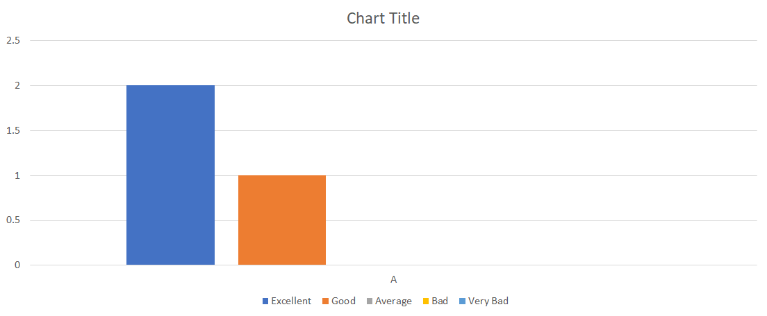
I would want to see a bar chart with Excellent, Good, Average, Bad and Very Bad on the x-axes and number of count on y-axes. Example as below;
Could someone tell me what I need to do? Appreciated.