Hi,
I use Cloud PBCS.
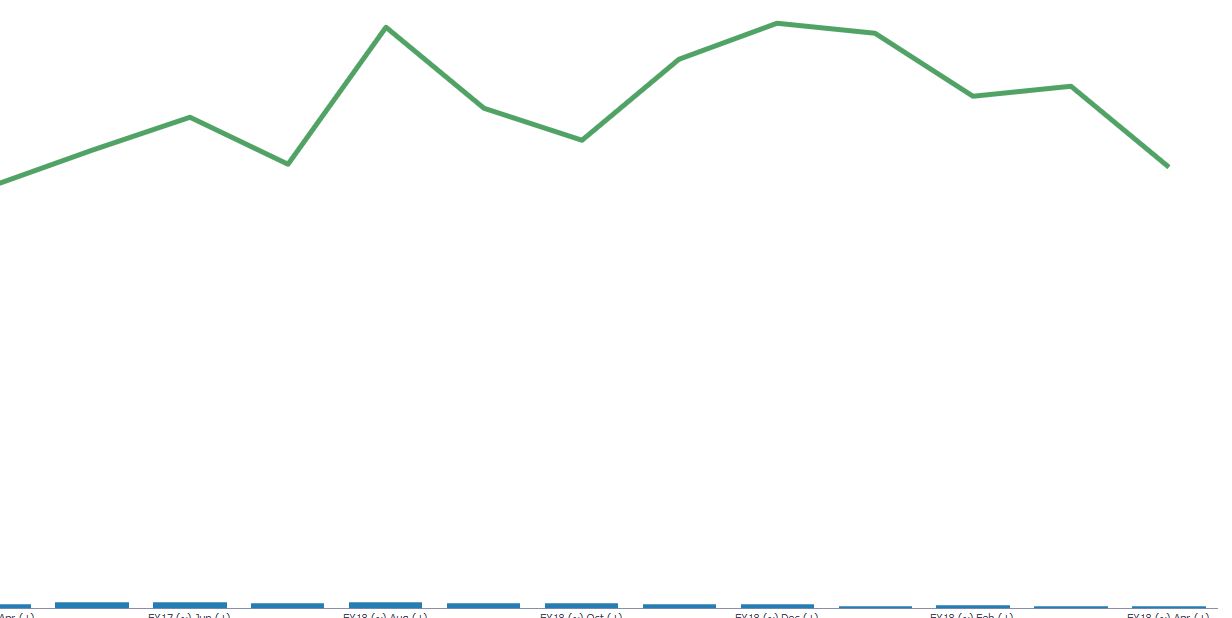
I want to do a dashboard with a combination chart using a form with 2 rows.
- Row 1 is units sold, which is typically 50 per month
- Row 2 is GP per unit, which is typically 5000 per month.
Is it possible to make Row 1 and Row 2 appear on different vertical axes?
Otherwise row 1 is so small compared to row 2 that the combination chart is of no use.