Hi All
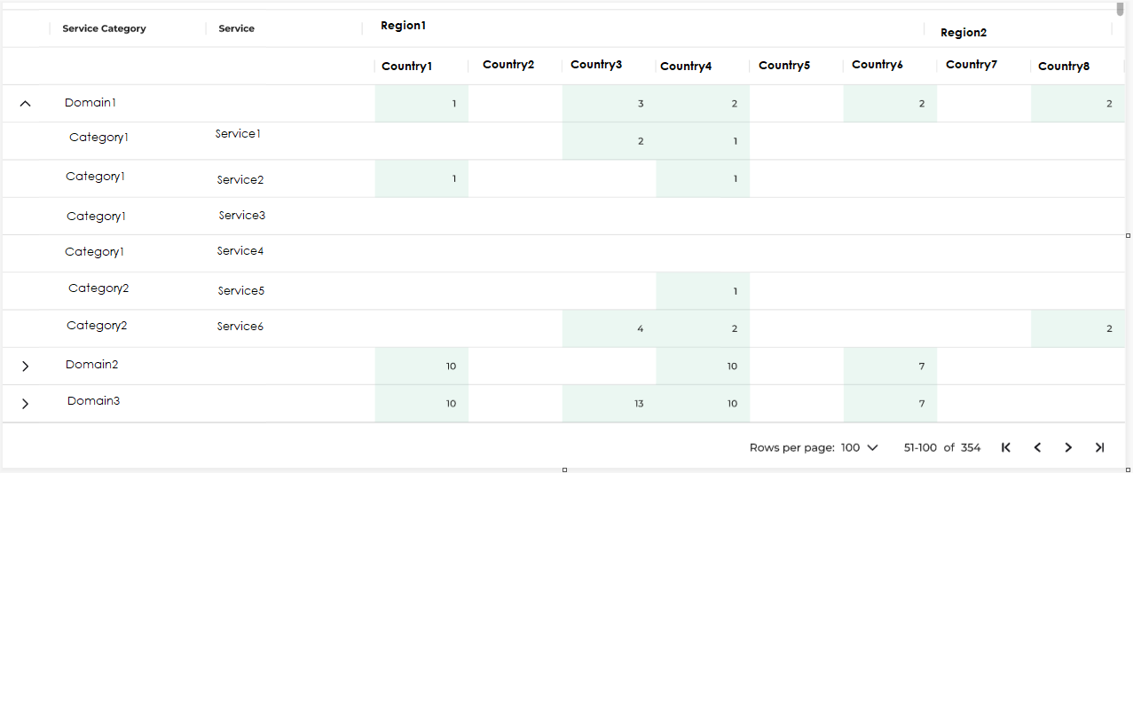
I have a requirement to create a summary table like the below picture. It came from a UX/UI team.
The summary is based on a simple view containing all the data about services being sold in the different countries.
DOMAIN, CATEGORY, SERVICE, COUNTRY, REGION
domain→category→service are a hierarchy. Same for country→region.
The table shows a row per domain. Once expanded, the sub categories and services are displayed.
Cells are a count of the number of services in the relevant country.
I could create a very similar table using an interactive grid and using the pivot feature and then hide the control buttons of the IG using CSS.
The only thing I'm not able to do is to have those “domain” collapsible rows which are actually showing the totals per domain.
Any suggestions on how to implement these rows within the pivot? Is it possible at all?
If this is too complex, would you recommend changing the layout design?
Thank you.