Hi all,
I have the request to show measured values depending on the time of measurement.
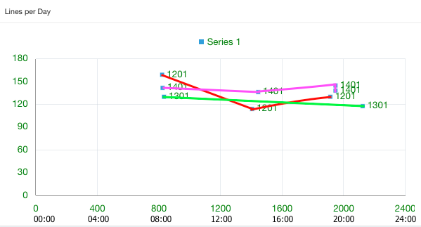
That means my chart shall show on the x-axes the time (00:00, 04:00, 08:00, 12:00, .. 24:00) and on the y-axes the measured values.
There may be 0 to many measurements per day. The values of one day should be connected by a line.
The customer defines how many days are shown (usually one month).
I want to create a line chart with a dynamic number of series (one series per day). But as far as I know it is not possible.
So I'm trying to fake this with a scatter-chart, where I group the values per day, but here I don't know how to draw the lines.
This is how it should look for 3 days:
You can see the scatter-chart on apex.oracle.com
WS: UB_DEMO
demo/demo
app 117288, p13
Now I'd like to have a line between all values of group 1201 (that means the 12.1.2015) and one line for 1301 (=13.1.2015) and so on.
I think the x-axes can be manipulated by js (400-> 04:00, 1200 -> 12:00), but I have no idea how to draw the lines.
Does someone have an idea how to implement this?
Thanks in advance!
Best Regards
Uli