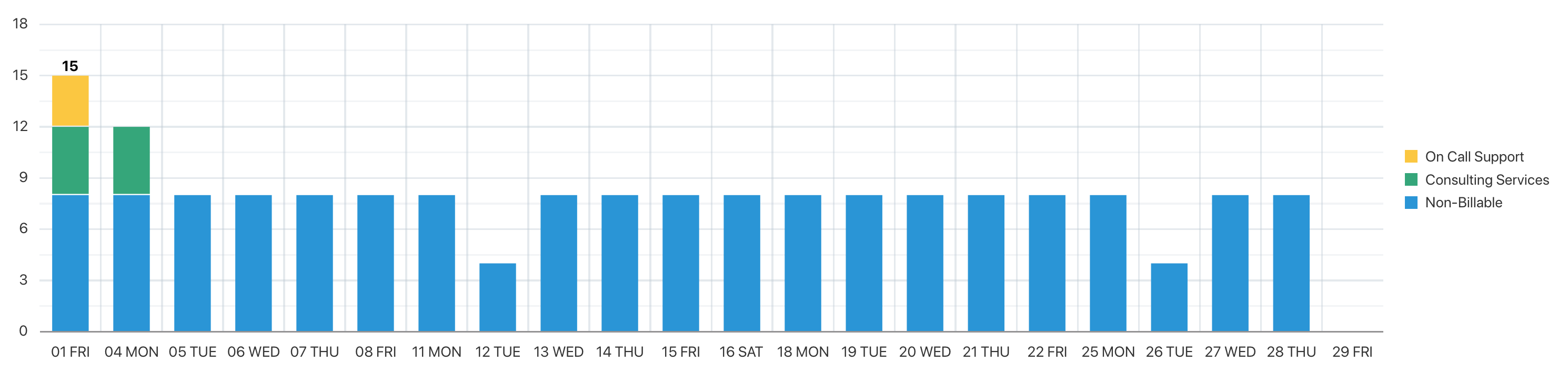
Can someone explain why a stacked bar chart groups things differently thant what the data shows it should be?
Data reflects number of hours worked on a given day for the month with a series based on tasks.
I cannot figure out why for the first day it is including values from other days.
DATA FROM SQL:
| 01 FRI | Non-Billable | 8 |
| 04 MON | Non-Billable | 8 |
| 05 TUE | Non-Billable | 8 |
| 06 WED | Non-Billable | 8 |
| 07 THU | Non-Billable | 8 |
| 08 FRI | Non-Billable | 8 |
| 11 MON | Non-Billable | 8 |
| 12 TUE | Non-Billable | 4 |
| 12 TUE | Consulting Services | 4 |
| 13 WED | Non-Billable | 8 |
| 14 THU | Non-Billable | 8 |
| 15 FRI | Non-Billable | 8 |
| 16 SAT | On Call Support | 3 |
| 18 MON | Non-Billable | 8 |
| 19 TUE | Non-Billable | 8 |
| 20 WED | Non-Billable | 8 |
| 21 THU | Non-Billable | 8 |
| 22 FRI | Non-Billable | 8 |
| 25 MON | Non-Billable | 8 |
| 26 TUE | Non-Billable | 8 |
| 27 WED | Non-Billable | 4 |
| 27 WED | Consulting Services | 4 |
| 28 THU | Non-Billable | 8 |
| 29 FRI | Non-Billable |
8
|