Hi,
I hope someone can help me or point me in the right direction.
My Oracle Database cloud was recently upgraded from 5.0 to 5.1 and I am pleased to report there were no issues with my production service.
All my Charts continued to work as AnyChart legacy charts - so that is also good news.
I am now in the process of converting my many charts from AnyChart to Jet and have found that for the more complex charts this needs to be done by hand - also fine.
What I am having difficulty is understanding exactly how I can control the fonts and font sizes for X axis, data labels etc.
Here is one example...
Pareto Anychart :

This has a really nice animation - which I know is a little shallow, but clients like it. I also prefer the x axis text to be horizontal and therefore reduce the font size.
Finally the % values on the line are clearly visible.
My best effort with Jet:
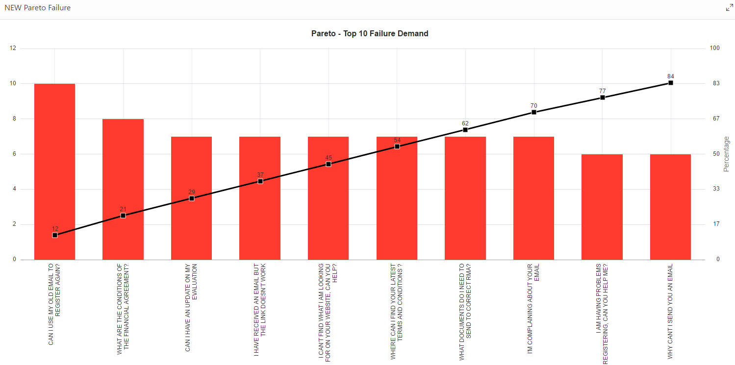
Can anyone help me understand how to set the x-axis fonts and the size / colour / background shape for the value marker on the line?
I know the label can be controlled with CSS Classes:
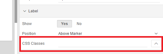
But I can't figure out how to make any classes show up here - where do I create these?
Sorry, just a little lost after many years for 4.2.
All / Any help greatly appreciated.
Steve