Hello,
I am using JDev 11.1.1.7.0
This is my first visualization requirement so i am trying to get my head around it.
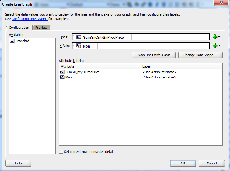
I want to build a graph that shows each branch sales (Y axis) across time (X axis).
The way i imagine it is a line graph with time on the x-axis and sales on the y-axis but separate lines for each branch. Of course if there is another solution i am up for it.
I am using this sql query for binding data:
SELECT
SI.BRANCH_ID,
EXTRACT (MONTH FROM SI.SALES_DATE) MON,
SUM(SII.QNTY*SII.PROD_PRICE)
FROM SALES_INVOICE SI , SALES_INVOICE_ITEMS SII
WHERE
SI.SALES_INVOICE_ID = SII.SALES_INVOICE_ID
GROUP BY
SI.BRANCH_ID,
EXTRACT (MONTH FROM SI.SALES_DATE)
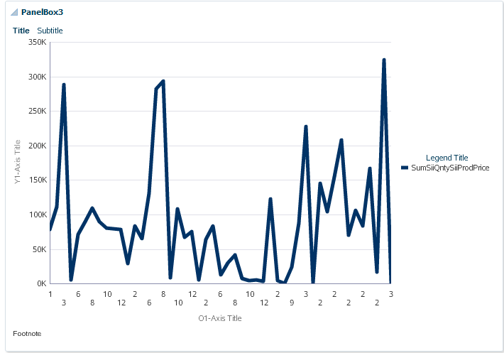
And this is my attempt:
| Graph Config | Runtime Result |
|  |
|  |
|
I don't even know what this result should mean.
Thank you
Gado